Evolve - brand
Brand transformation is a fly away success for Evolve's busy clinic


Challenge
Creating a leading brand that communicates both clinical excellence and exemplary patient care
Evolve is a leading independent provider of neurodevelopmental assessments and psychology services. The team serves both NHS patients, private clients, as well as delivering expert witness services. The practice is built on a desire to offer clinician-led care, expert guidance and support, as well as a warm, patient-centric care that supports each individual on their journey.
Evolve initially approached us for a new website. However, it soon became apparent that a brand transformation was the best place to start.
The challenge here is to differentiate from many other providers as well as organisations like the NHS, whose brand may appear cold and overly clinical. We sought to create a brand that combined trust, expertise and knowledge, with warmth and human touch – and also conveyed the hands-on, expert care Evolve offer.

Vision
Reinvigorating and revitalising a familiar brand
The existing butterfly logo elements remained symbolic of the transformation people can go through with Evolve's support. However, the team felt that they had outgrown many aspects of the original brand.
This lack of a clear brand – and failure to determine a distinctive voice – needed to be fixed so the team could continue its significant growth with a clear identity, and importantly, one that was standout in the sector.
Craft
Shaping Evolve's new brand with a workshop – exploring colours, imagery, font choices and the business
As is often the case, this process started with the need for a website, but through the initial discussions it became clear that the brand was not working in its current form. A renewed brand should come before any website development.
We ran a strategy session to get to the bottom of what key team members felt about the Evolve brand, its equity, legacy and what they wanted the future to look like. Part of this is a workshop – responsible for the resulting vision, mission, values, pillars, personality and tone of voice in the brand guidelines. Through a series of hands-on exercises covering colours, imagery, font choices and deep dives into what Evolve stands for, we are able to take away a wealth of information that fuelled and shaped the creation of a brand that accurately reflects Evolve.
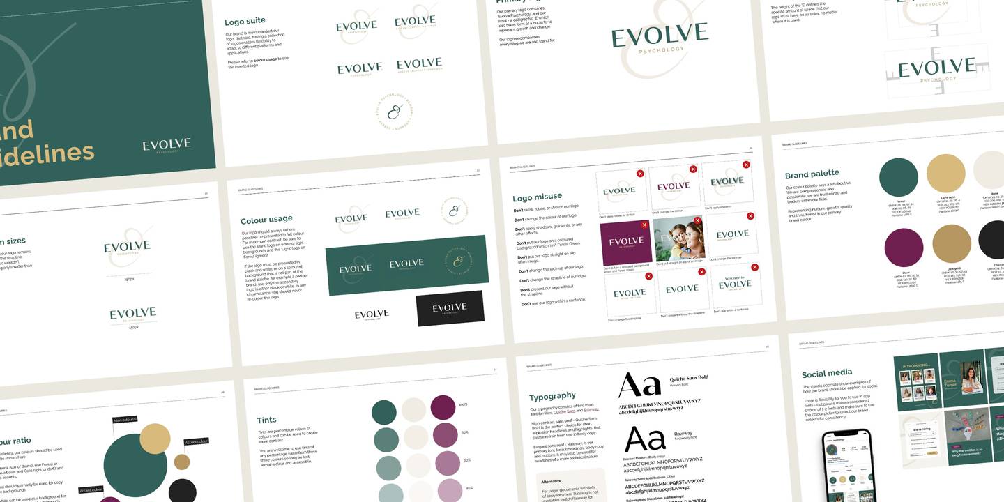
At this stage, we created stylescapes – elevated moodboards to help shape colours, choices, shapes and graphical elements. The brand guidelines is a deck that explores and shapes the revised brand pillars, vision, mission, values, personality and more.
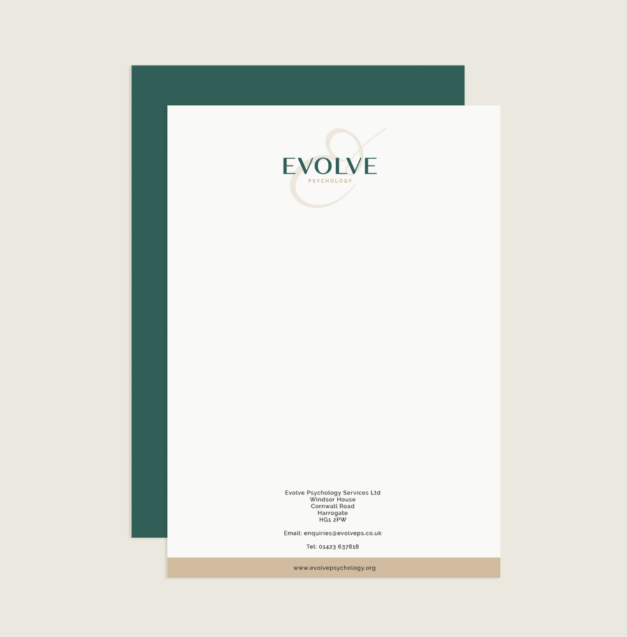
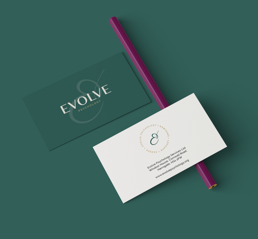
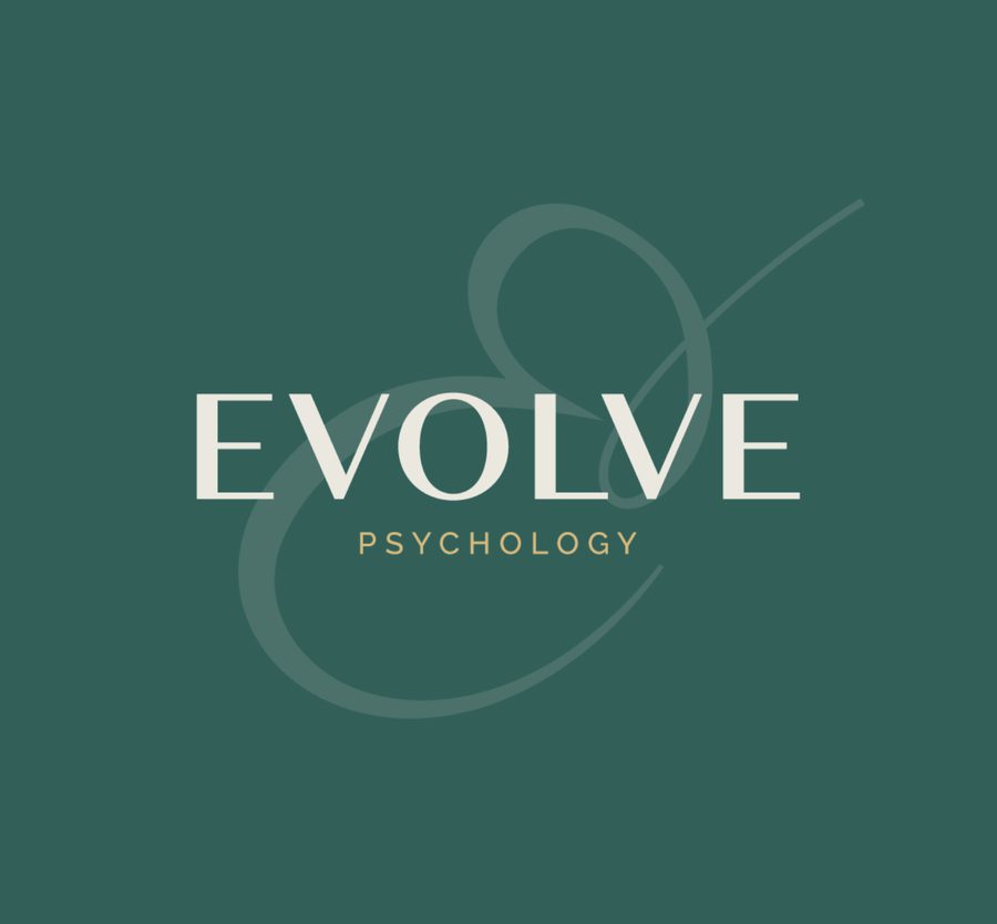
Despite wanting to move away from elements that existed in their original logo, it was the butterfly – a symbol of evolution – that just kept appearing in conversations. In the end, it was a combination of the ‘E’ and the shape of a butterfly that formed the logomark. The calligraphic style of the logomark is a nod to the human hand, flowing and organic. This is paired with an elegant humanist san serif font to make up the full logo.
A colour palette of rich, warm and nurturing greens and purples – with gold as an accent – were designed to be the opposite of cold and clinical.

Deliver
A classy brand that showed empathy and professionalism
The deliverables for this project included the final logo design and brand guidelines.
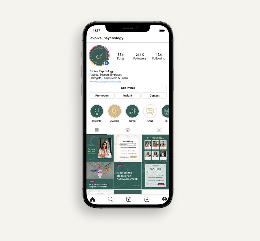
The new, revitalised branding which feels rich and communicates the quality of care, expertise and support – reflected in the renewed colour palette. The butterfly remained, but art imitated life as it was developed and transformed into a more modern, slick and tasteful version of itself for the new Evolve era.
In projects like this one, the brand is the foundation of all future marketing.