Challenge
A brand-new look that captures a feeling of heritage
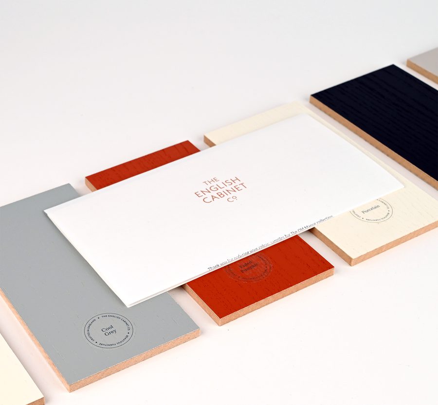
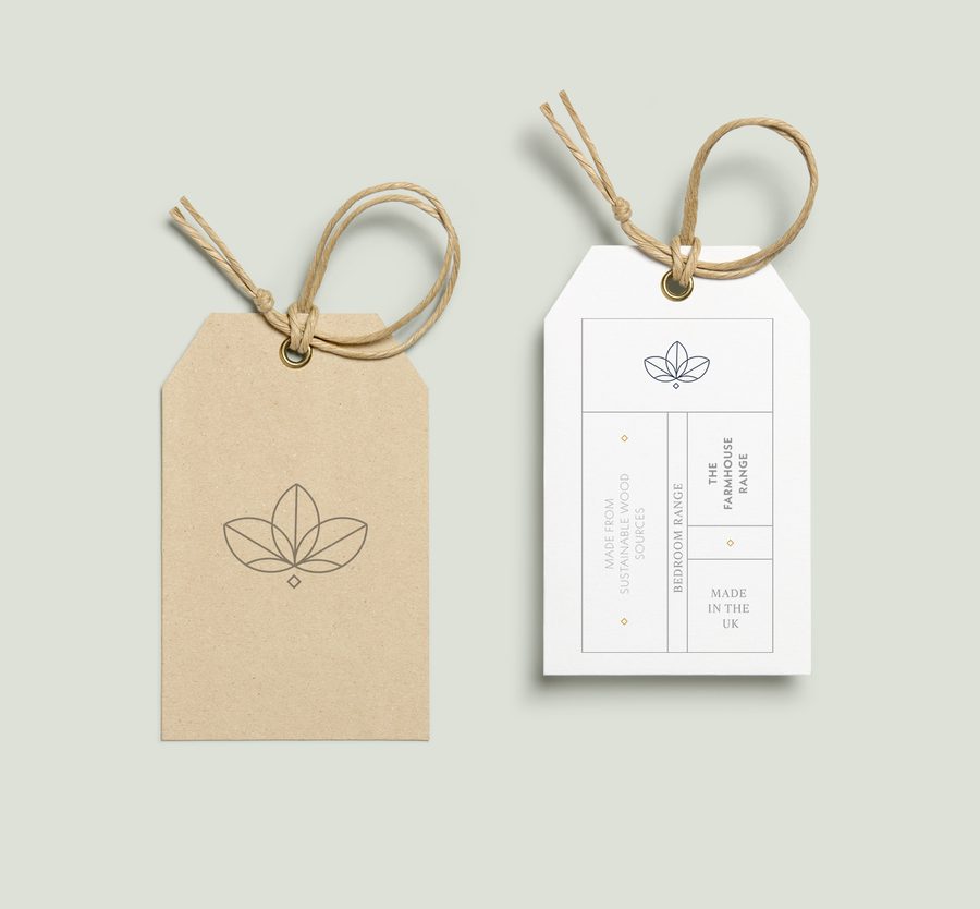
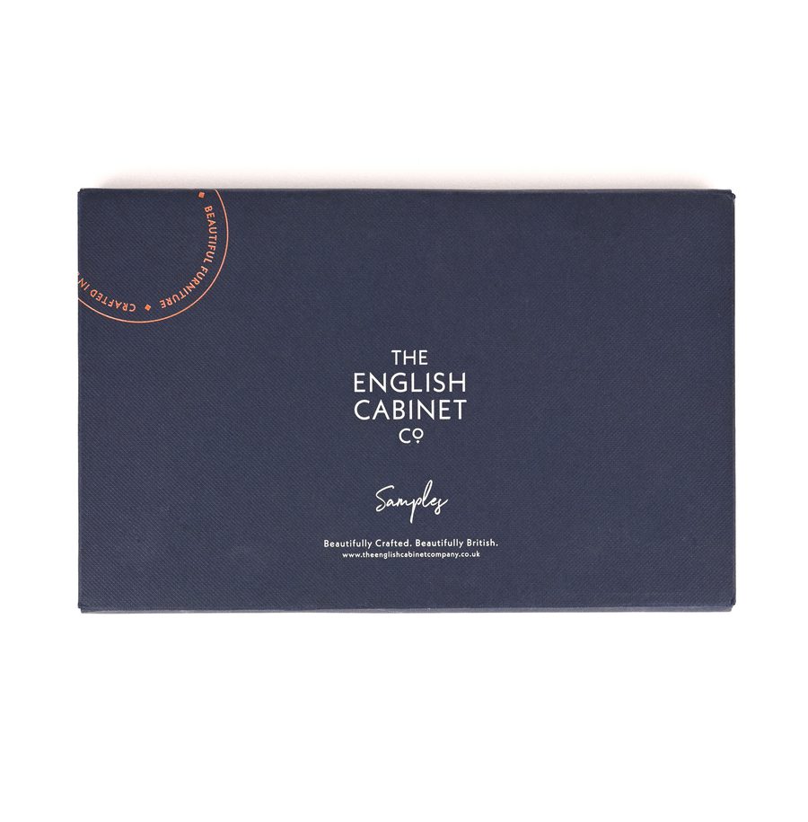
The English Cabinet Company were embarking on a new online-only venture, so the digital experience was going to be central to the customer journey. The new identity needed to feel established, whilst maintaining a sense of heritage and needed to be flexible - yet robust enough - to work across both contemporary and traditional touch points. This meant a visual identity that would work just as well on their website and social media, as on their product swing tags and packaging.
Vision
Hand-made, high-quality furniture, worthy of a permanent place in the home
Our vision was to develop a visual identity which championed traditional carpentry and craftsmanship. It needed to communicate the hand-made and high-quality, British manufacturing processes behind these products.
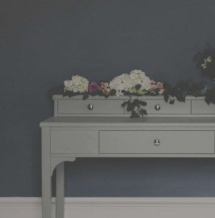
The English Cabinet Company and their customers believe furniture purchases should be viewed as a long term investment, rather than as throw away fashion pieces. With that in mind, the identity needed to resonate with people looking to invest in high-quality furniture that were both on trend, but reminiscent of classic pieces capable of enduring.
Craft
A contemporary visual identity—rooted in traditional carpentry
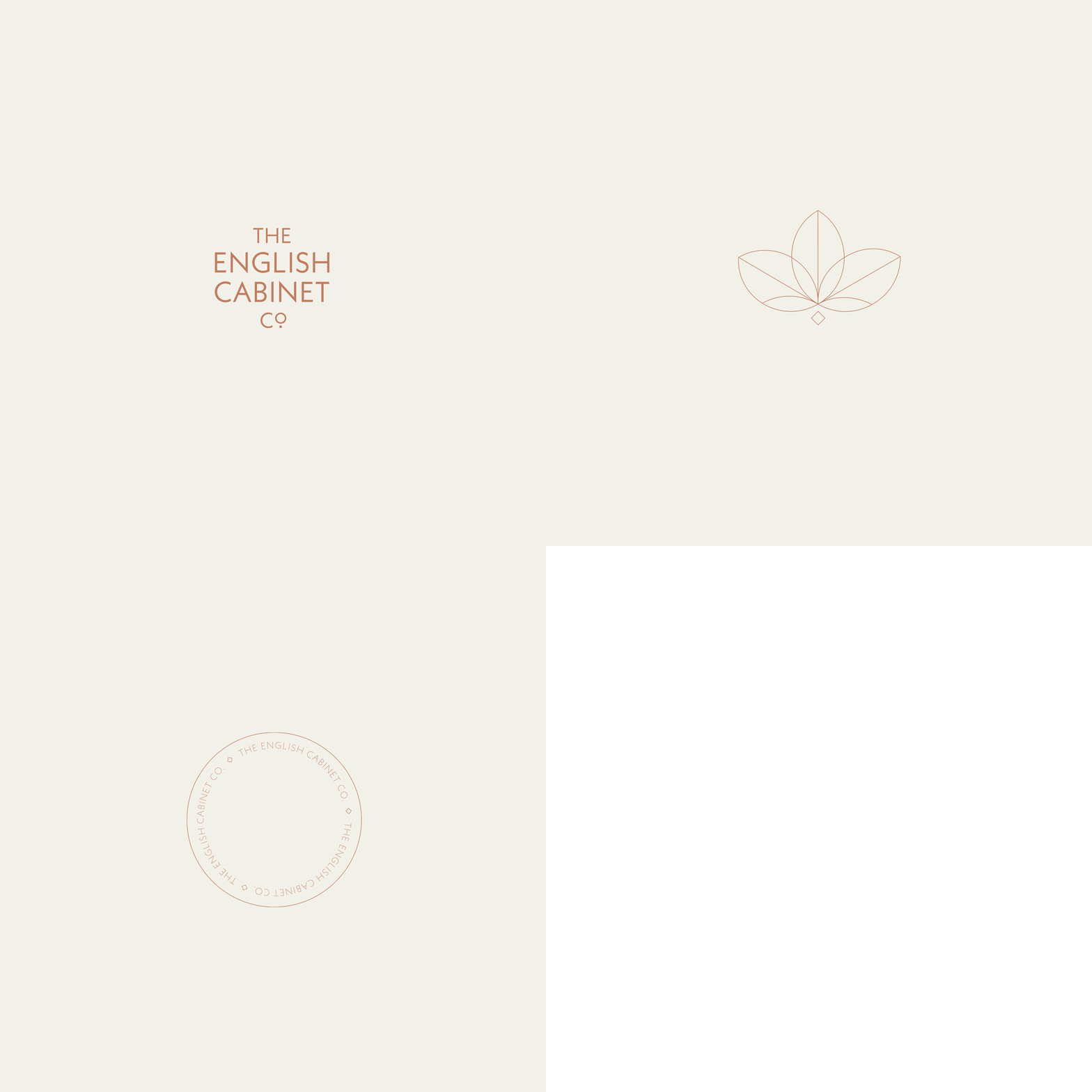
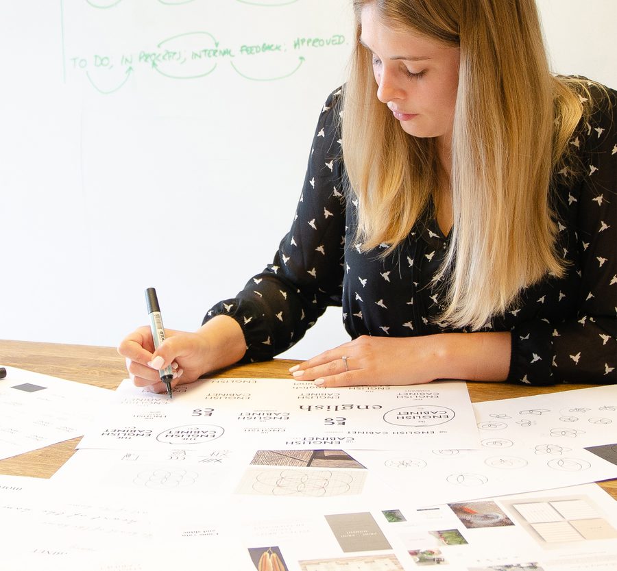
We drew inspiration from traditional carpentry, taking particular reference from the marks that carpenters would make by scribing, chiseling or gouging into timber. The structure of the brand mark is based on the carpenter's daisy wheel and gives a nod to the hand-crafted quality of the furniture.
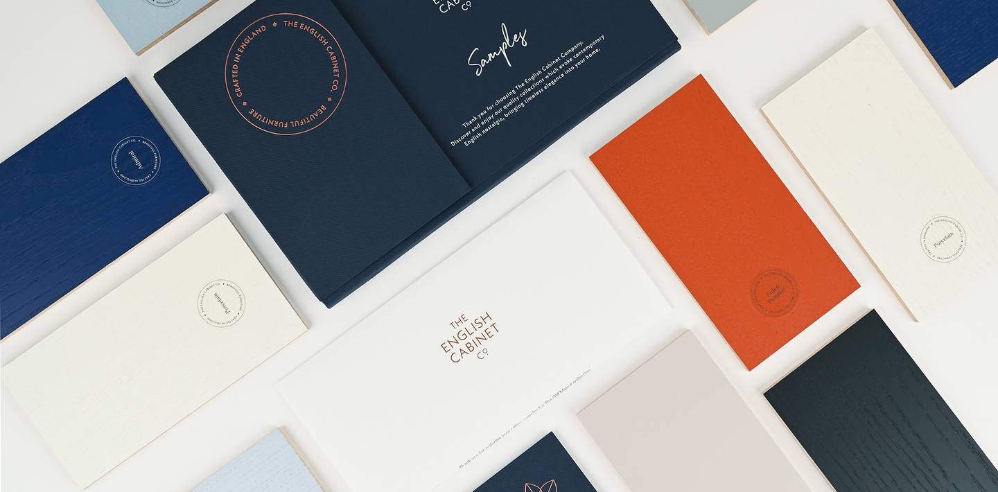
The traditional elements are paired with more contemporary typography—suitable for digital applications—and a bright, modern colour palette to bring balance to the identity.
Deliver
Trust and reliability with a touch of luxury
The resulting visual identity captured the essence of the brand; communicating trust and reliability, with a little hint of luxury. The flexible system was ready to be applied across multiple touch points across both digital and physical brand experiences.

