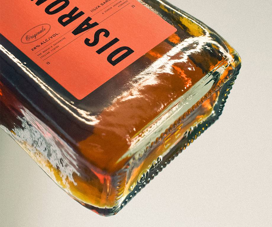
Disaronno - a brand synonymous with Italian glamour, al fresco dining and elegant cocktail bars - has a history dating back to 1525, and since then it has dominated the market as the leading amaretto liqueur worldwide.
Steeped in Italian heritage, the story goes that a sweet-tasting amber drink was given as a simple gesture of kindness some 500 years ago to an Italian artist from a local woman, as a thank you for choosing her to be his muse for a painting. Eventually the recipe came into the Reina’s family’s possession and since then it has been kept a family secret.
As the world’s favourite Italian liqueur, it provides a sense of luxury while being accessible to all at a reasonable price point. Its signature sweet and nutty aroma, indicative of the almonds, vanilla, caramel and apricot seeds it contains, is loved around the globe and is a staple in almost every bar and restaurant you walk into.
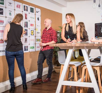
In line with recent efforts to connect with younger target audiences, one of our brilliant designers chose the brand for a self-initiated project, providing it with a new visual look while maintaining it’s heritage.
We spoke to Teo about his thought process behind the brand revamp, exploring how he breathed new life into this Italian classic.
Why Disaronno?
The brand really stuck out to me as it has a lot of history and is such a unique product on the market. They recently released new products including premixed cocktails, tapping into the growing market for both at-home and on-the-go drinks, which is set to grow to be worth over £500million over the next five years, according to Mintel.

They seem to be transitioning in an effort to keep up with the ever changing demands of millennials, having invested more time and budget into their social media marketing over the years with a heavy focus on building a network of influencers who can connect with their target market of 25-40 year olds. To stand out in such a heavily saturated space, I think their brand needed to be modernised while remaining true to their Italian roots.
What was the challenge?
The challenge was to take this iconic brand and product and remove it from the dusty past, throwing it into the present to thrive amongst millennials as an essential alcoholic drink of choice.
What was the vision?
The vision was to sell the Italian dream - a timeless classic but with a modern edge. The main direction I took was to develop the brand by giving it a simplified but consistent structure to keep it grounded, while allowing it to grow across new product ranges for another number of years.
The colour scheme was built out of aspects that represented the country. The blues and greens symbolise nature and water, while the earthy stone colours were used to represent the architecture. The bright, deep orange was the final colour to bring in a touch of vibrancy to the palette, representing the lively culture Italy is known for, tying it all together.

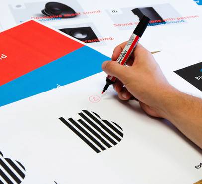
This cemented the basis of the designs for me, which helped when developing the typographic layouts. Italian’s are bold with big personalities, and so to showcase this, I paired the colours with big areas of type that run full bleed. The type includes various fonts that are delicately placed in big and small areas to give more detail and a crafted feel to the overall look.
Where did you start?
I started by taking large inspiration from the classic heritage of Italy that thrives today, which always seems to have a timeless and stunningly simple air to it. An older, more traditional look gives a gentle nod to the history of the company and can help to make a brand appear to be more luxurious than something that’s trying to be brand new or futuristic. Italians tend to be old school when it comes to culture, values and meaning, so I thought that would make the perfect base to build the brand out of.
After researching the brand history, I learnt how important the shape of the bottle was to how recognised Disaronno is globally. This was something that could not change, which really pushed me to think outside of the box when incorporating a modern edge to the classic product.

What was the biggest challenge?
The challenge was finding a balance between staying true to the deep rooted history and age of the brand while seeing how far the design could be brought into modern day.
I’m really pleased with the final product, I think it’s brought Disaronno into the present, helping it to connect with a younger audience while retaining a sense of nostalgia and heritage. It was a brilliant project to work on and it felt great to stretch myself creatively. I look forward to my next challenge, and am excited to see which brand I’ll choose to work on next!
You can read about the full process and see even more of Teo's designs mocked up in our latest case study.
Do you need help designing or redefining your brand?
Get in touch!Post by

As our dedicated Social Media Designer, you'll find Sally behind either behind a screen or behind the lense capturing the essense of all the brands we work with. As Extreme's star baker, you might also find her in the kitchen cooking and styling dishes to look mouthwateringly delicious. If you ever find yourself drooling on your phone, that's probably one of Sally's creations!
Project