Investing in paid media and paid social strategies is fantastic for driving traffic to your website, but if you're struggling to convert these visitors into sales or sign ups, then you might have an issue.
If this sounds like you, panic not. There are a variety of reasons your conversion rate may be lower than you’d like — our UX experts are here to help!
What is conversion rate optimisation (CRO)?
CRO is the practice of increasing the percentage of users who perform a desired action on a website — whether that be completing a sale, filling in a form or signing up to a service. The average conversion rate for e-commerce in the UK as of December 2022 is 2.13%.
Digging a little deeper, it’s about understanding your site visitors – what drives them, what puts them off and what convinces them to ultimately complete your Call To Action (CTA) – then optimising your site to best serve their needs and expectations.
How exactly should you do that?
Let’s explore some of the reasons your conversion rate may be low, and the tactics you can use to deliver a quality user experience by removing the barriers to conversion on your site and maximising the impact of your marketing efforts.
Key considerations for conversion rate optimisation: what is holding back my website?
It might be that your site is difficult to use on mobile, lacks quality content and imagery, you have ad inconsistencies or there's a long, overly-complicated check out process. User experience (UX) lies at the heart of things — poor UX will result in the loss of a quality lead.
Take a look at see if you reckon any of these might apply to you and your website.
Your site provides a poor experience on mobile
User experience (UX) is about providing a positive experience to everyone who visits your website. How easy is it for them to achieve the goal you want them to accomplish?
With mobile devices accounting for almost two-thirds of all web traffic, you don't need us to tell you that mobile-responsive design is key.
Consider your site speed, ease of navigation and checkout processes. Keep your website up to date with the latest offers, product availability and new ranges or services.
Your website speed should ensure quick and easy access to the relevant landing pages - always. Customers don’t have time for slow loading times or glitchy pages. 53% of mobile visits are abandoned if a page takes longer than three seconds to load.
Your site should pass the ‘thumb test’; 75% of mobile interactions are thumb-driven. That means positioning your most commonly clicked links and CTA’s in easy-to-reach zones so they can be navigated with thumbs.
Additionally, if your navigation is confusing, unorganised and illogical, you’ll instantly lose potential customers who don’t have time to sift through your site. As such, your virtual store’s design must be clean, systematic and easy to navigate (usually hierarchical).
Consider incorporating product categories into your search capabilities, while ensuring your brand’s contact details and FAQ pages are easily accessible.
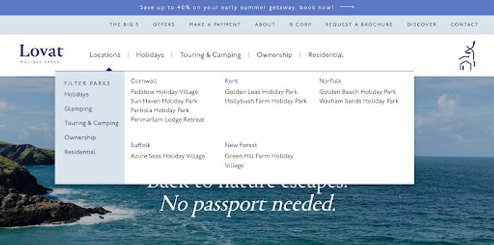
Use carefully considered pop-ups or banners that don’t overwhelm the user and add value to their experience.
For example, one could include an offer for 10% off their first purchase, or perhaps give early access to a brand event or limited edition product run. They’re a great tool for gathering first party data, just use them in the correct way to maximise their effectiveness and drive conversions.
Inconsistency and issues with your ads
At times it may appear that your campaign has a high click through rate (CTR), but still only achieves low conversion rates. In these cases, it may be down to your website looking different to and lacking consistency with your ad creative, which may be considered misleading by potential customers.
If your ad brings a visitor to the wrong landing page which has nothing to do with the product or service they were initially interested in, they’ll almost definitely leave the website rather than trying to find it on their own through the navigation system.
As such, it’s vital your landing pages are in line with and expand upon your paid media and social ad creative. Whether it’s for a specific product, a seasonal sale or to reveal an offer, curate and link to optimised landing pages to avoid losing the conversion.
Your checkout process is unfamiliar, excessively long or unrewarding
An obvious cause of potential customers dropping off just before they convert. It’s important you make the buying process as simple as possible.
If it’s not, you risk your customers finding other routes to your products or those of your competitors with indirect platforms like Amazon due to the ease of already having a profile set up and the convenience of next day delivery.
Strip back all barriers to conversion — massive amounts of text, confusing information fields, and complex sign-up forms.
Instead, opt for clear messaging and simple payment options. Using familiar e-commerce platforms, like Shopify and Magento, can help you to provide a checkout process that's familiar and reassuring to users.
If you’re looking to add more value to your customer’s order, you could also offer the addition of a free gift. You could also give the option for visitors to continue to check out as guests rather than go through the process of setting up a new profile with you.
Remember, the key is getting them through the payment process as quickly and efficiently as possible. You can still gather vital information such as email addresses this way, meaning you can continue to build your contact list for future marketing outreach campaigns.
Issues with your website’s overall design
Issues with functionality is one thing, but the overall appearance of your website is another key factor when it comes to CRO.
Your site is the equivalent of a shop window when it comes to showcasing your products and services to potential customers. If your design looks low in quality with inconsistent typography, blurry imagery and incoherent colour schemes, it reflects poorly on your brand and is indicative of the quality of the product or service your customer can expect from you.
When designing your website, carefully consider your customer’s journey and what information is most important to them. If high quality imagery and product shots best illustrate what you’re offering, focus on pairing them with informative but short descriptions. After all, a picture can be worth a thousand words.
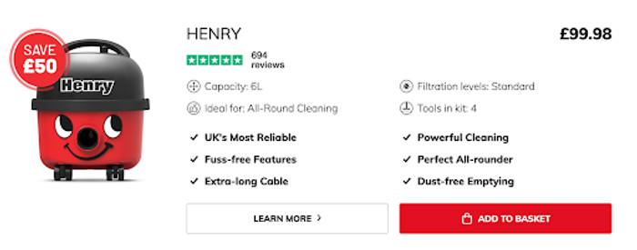
If your product has lots of features that need to be listed to educate and inform the user, it’s better to use concise bullet points rather than masses of text, which can be off-putting.
It’s important you follow best practice when it comes to your website’s usability. Is text islarge enough to read? Is it formatted properly? Make appropriate use of headers to structure your content.
Another obvious aspect to this is ensuirng you choose an on-brand colour scheme that has no clashing colours. The aim is to impart information in a visual, clear way.
Your site lacks quality content
Your site has to look and sound good in order to drive conversions.
Quality content is key not only for search engine optimisation, but also to engage, inform and persuade users to perform your desired action.
Consider what information they want to find, then create insightful and accurate product descriptions, informative blog content and a thorough FAQ page to help guide them along their path to purchase.
Serving useful, relevant content on your website also helps to improve your Google Ad quality scores, resulting in more cost-effective campaigns.
Now, it’s important you use language and a tone across all your content that connects with your audiences. Whether your brand’s personality is chatty and humorous, or more formal and professional, be sure all your written copy is aligned with your tone — so it all sounds distinctly you.
... you might also lack quality imagery
When it comes to imagery, site visitors want to see lots of high quality pictures of the product they’re interested in buying. They also prefer to see the products in action, so try not to rely too heavily on stock imagery.
With visual search growing in popularity — according to Invespcro, more than 36% of online shoppers say they have used visual search and more than half of them claim visual information is more useful to them than text information — imagery is playing an even more pivotal role in consumers finding your products. You can optimise your website imagery for Google Image search by using descriptive alt text.
You're not providing strong enough trust signals
Customers go on a long, convoluted journey when deciding to purchase a product or service.
They might see an ad, watch a YouTube video, then see a YouTube ad, look on Reddit, check out a blog post... but a hugely important part of most customer journeys is checking out reviews from fellow consumers. They want an authentic, non-biased judgement.
Add testimonials and reviews onto your website, perhaps from Trustpilot, to help convert visits into sales or sign ups.
There’s no incentive to make a purchase
No one likes missing out on getting a deal on a great product or service, and so it’s important you create a sense of urgency to help drive conversions.
Leverage the power of FOMO by communicating why your user must perform an action, or risk losing out on a limited-time offer. You might call this 'dark side' marketing, but it's a tried-and-tested tactic that can be used both on your site with a banner or pop-up, as well across your marketing activity, with a timely social media post, paid ad or email campaign.
Exclusive offers and deals also help to provide an incentive for users to buy directly through your website as opposed to third-party sites like Amazon. Even if it's just free shipping, you'll be maximising the effort you’ve made to get them to your website in the first place.
You have unclear CTAs
Having a clear call-to-action (CTA) is key to driving conversions, so be sure they’re highly visible on your site. Design them to be bold and bright — clear and concise. What exactly will the user will by clicking on it?
Place CTAs in appropriate areas where users would expect to find them. It just makes sense to have an ‘add to basket’ button next to the product imagery and description, while your social media profiles can be linked in the footer alongside your contact details.
You’re promoting out of stock products
Shopping ads for products with 100% stock availability (in all sizes) receive the highest conversion rate. This rate drops in line with stock levels; fewer sizes and less availability means fewer conversions. Simple but obvious!
Be you have sufficient stock of the products used in your paid advertising across social media or Google Shopping to avoid disappointing potential customers. If you can’t fulfil demand, you'll jeopardise your return on ad spend (ROAS) and miss an opportunity to build a relationship with that new user.
You’re disregarding the data
A key reason for low conversion rates could be incorrectly installed tracking codes. They could have been corrupted when making changes to your site, such as curating new landing pages, or even with the launch of a new promotional campaign.
Google Analytics and Google Tag Assistant are great tools for easily identifying where your tracking issues may lie and checking they’re set up correctly, helping you to avoid gathering data that isn’t accurate and painting a much more realistic picture of where your sales are coming from.
Speaking of gathering data and insights, it’s also important you carry out some A/B testing when finding what best suits your customers. This allows you to trial two different elements in real-time and understand which is more effective before moving forward with the more impactful campaign.
While it’s useful to look to your industry for guidance on what appears to perform well, remember that your customer behaviours are unique, so it’s better to follow the data than to follow the crowd. You may also take inspiration from other industries and sectors, but again, remember to always come back to what you know about your customers, as that should fundamentally underpin your decisions.
Try looking at heat maps to understand their behaviours, checking which part of your landing pages people click on and where they may be dropping off. That way you can optimise your site to best suit their needs, and drive your conversion rate up.
You're not incorporating CRO into your wider marketing strategy
Lastly, try not to hyperfixate on one single element of your marketing mix. It’s all an ecosystem that works together in what we like to call the ‘messy hexagon.’
Our updated take on the more traditional sales funnel emphasises how each customer will be different. Some will go straight from trigger to purchase, while others may take their time to get to know your product or service.
Some may interact with your brand when they don’t need the products, but remember it when they do and purchase at a later date when the occasion arises. Remember the 95/5 rule — only 5% of your potential customers are ready to buy right now.
A holistic view, where all touch points are considered and aligned (including paid media and paid social ads, as well as an optimised site) will help to grow your conversion rate, and should, ultimately, drive sales.
Need an expert eye to review your site and help with your CRO?
Get in touch with our team of UX experts!Post by
Project
