Alchemize - Brand
From an idea to brand gold: creating Alchemize


Challenge
Communicating expertise, commanding trust and cutting through industry noise
Stephen has forty years’ experience in leadership roles, including scaling, exiting and selling companies. He wanted to turn this wealth of practical insight into meaningful support for others.
He knew the brand needed to feel human, authentic, and trustworthy. Building from the ground up, he brought extensive business knowledge, but needed help to articulate this offering.
In an initial discovery session, we explored his personality, working style and deep understanding of the setbacks experienced across every stage of business.
Our mission was to translate this drive and authenticity into a relatable brand story, opening a new chapter for Stephen and those he mentors.

Hybrid coaching and mentoring that delivers sustainable growth for business and individuals
Vision
Brand alchemy: turning the idea into a gold-standard brand strategy
Starting from scratch gave us a rare opportunity to create a cohesive identity without compromise.
From naming and colour to typography and imagery, having creative control from the outset allowed us to ensure every core element works together.
Coaching and mentoring demand vulnerability, so the brand needed to project strength and confidence, while staying warm and accessible.
We began by discovering what Steve really cares about, what he brings to the table and how this could translate into services people would pay for.
Craft
A strategy workshop to turn ideas into action
Hands-on exercises in our strategy workshop unearthed key insights on Alchemize’s goals and target audience, all of which shaped the creative process.
- Naming: We explored words and concepts that represent the company's style, objectives and services and presented a curated shortlist. Alchemize was born: a name that reflects the transformation Stephen delivers, embodying progress, partnership and potential.
- Developing the visual direction: We designed three stylescapes using running as a metaphor for personal growth. The lighter aesthetic with softer tones struck the perfect balance of warmth and strength.
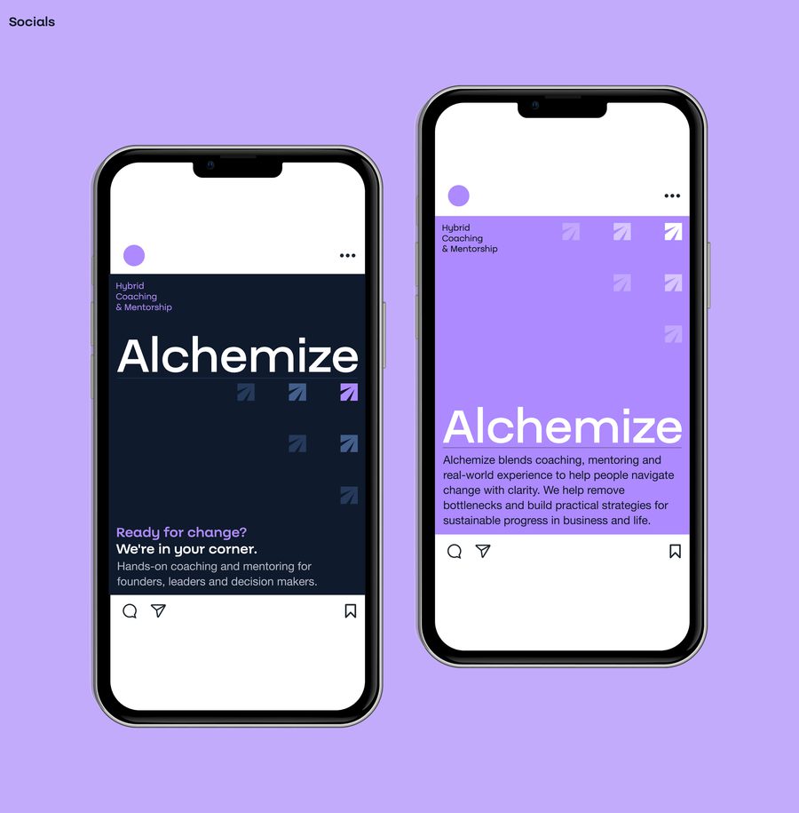
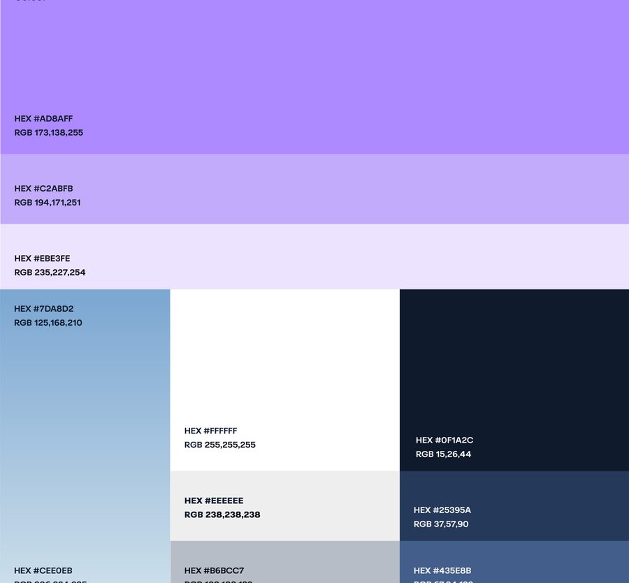
- Colour and typography: A light purple palette, a personal favourite of Stephen’s, was paired with the geometric Batica typeface for an approachable, contemporary feel.
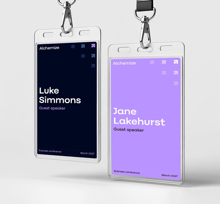
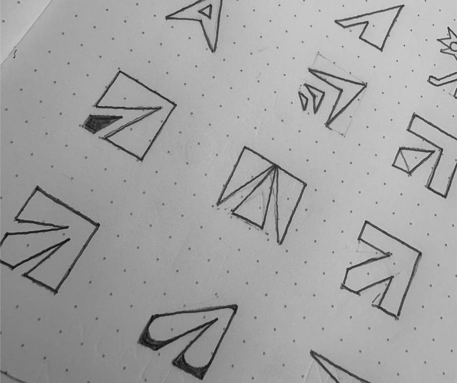
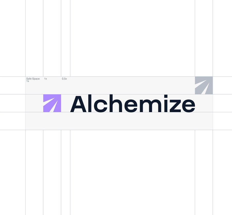
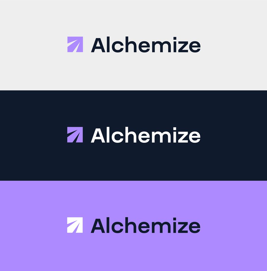
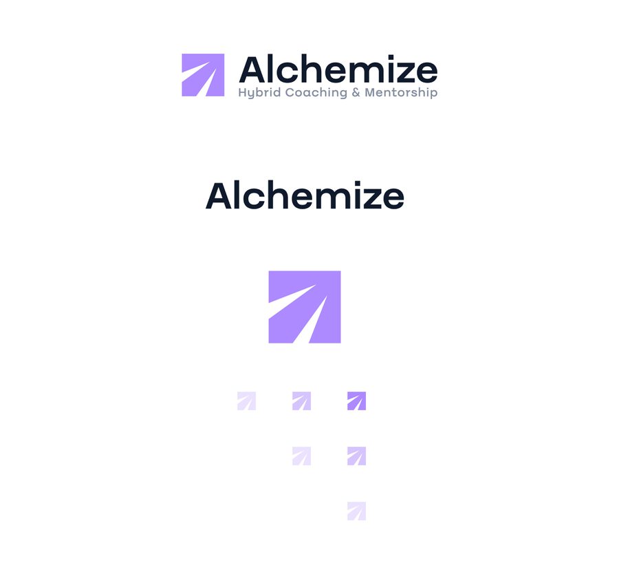
- Brand icon: A geometric arrow signals direction and trust, with upward movement for progress, negative-space growth lines and subtle ‘A’ angles.
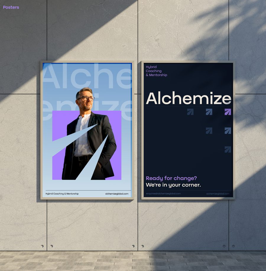
- Space, composition and messaging: Generous negative space and corner positioning allow key elements to breathe while connecting directly to the tagline, ‘we’re in your corner’.
Each creative decision serves one unified, cohesive visual language.
The result is a confident, distinctive identity that reflects Stephen and communicates Alchemize’s values with clarity and consistency.
Deliver
A brand that engages, inspires and feels authentically human
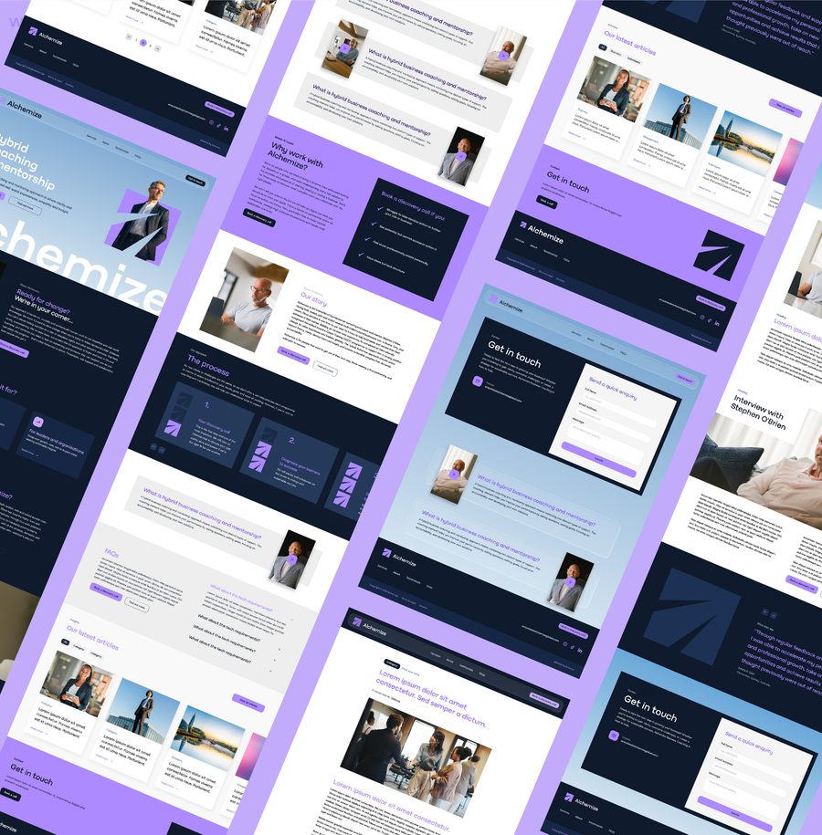
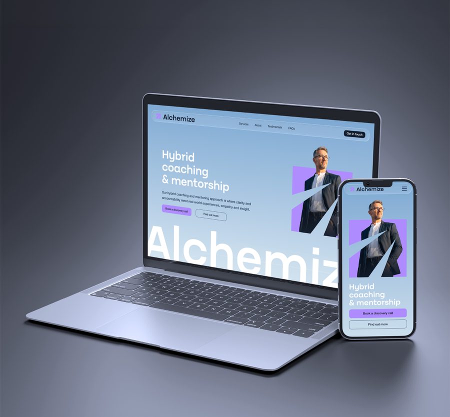
The deliverables for this project included the business name, final visual identity and brand strategy covering values, pillars, tone of voice and personality.
The result is a bold, confident brand with Steve at its heart.
This brand launched alongside a website built by our development team.