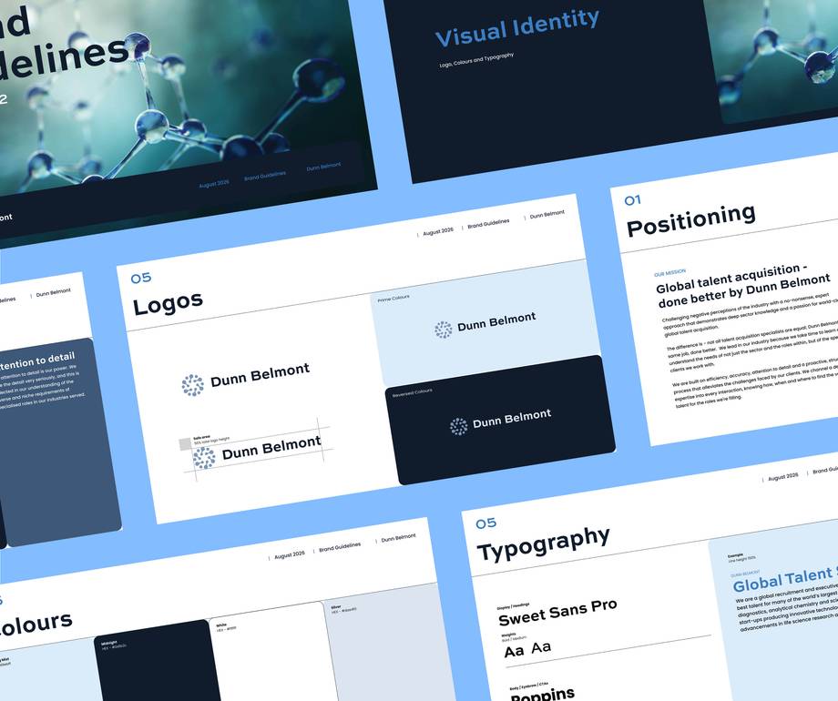
Dunn Belmont - Brand
Brand chemistry: a clean, contemporary identity for Dunn Belmont


Challenge
Communicating stand-out expertise and in-depth sector knowledge
Recruitment and talent acquisition are competitive areas where experience and deep client knowledge are the keys to building trust, especially if working internationally.
Dunn Belmont supports recruitment for roles across many technical areas. Behind its offering is a roster of pre-qualified, ready-to-go candidates that are expertly matched for specialist roles, from such as laboratory positions and imaging technicians.
They came to us seeking a website to support their expansion into new markets.
But, as is often the case, when delving into needs, plans and how they feel about their existing first impression, it was agreed a brand evaluation and refresh should be the first port of call.
This refreshed brand would then feed into the new site.
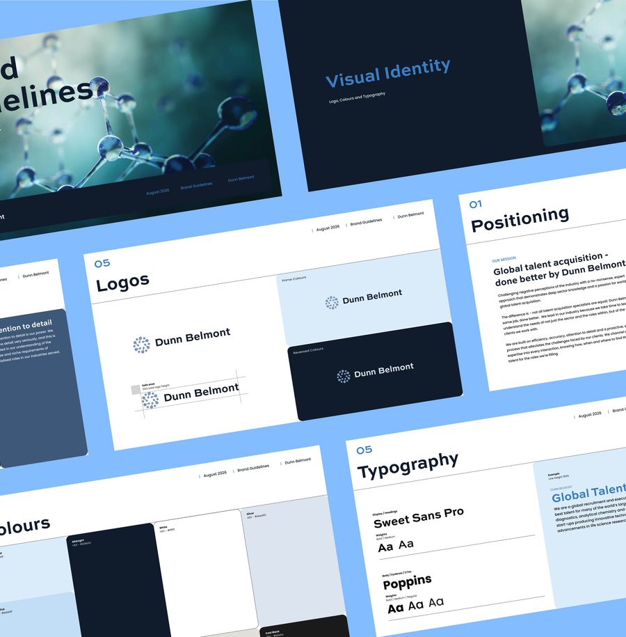

Global talent specialists working across highly-skilled and technical roles in science, medicine and manufacturing.
Vision
A sleek, minimalist brand uplift and refresh of their original identity
It was crucial to communicate the team’s specialist sector expertise and support their plans to grow their own team.
Dunn Belmont lacked any brand strategy, positioning or tone of voice documents. To put the right foundations in place, we outlined a joined-up approach to communications and positioning, ready for this expansion.

Craft
A tailored strategy workshop, to move from ideas to planning
These sessions are an important opportunity to unearth the needs, wants and markers for success of a brand, and give the client a chance to share thoughts, insights and aspirations.
Through a series of hands-on exercises that cover colours, imagery, font choices and in-depth overviews of the organisation, we took away a wealth of information to shape the creative stages of the brand process.
We then created stylescapes. These are elevated moodboards to help shape colours, choices, shapes and graphical elements in line with the session’s information.
We also put together a brand strategy document, a deck exploring and shaping Dunn Belmont’s revised brand pillars, vision, mission, values and personality.
The process also involved working through potential development of bespoke graphical elements that would help (alongside a new strapline), to support and convey the team's expertise across global scientific, medical and industrial roles.
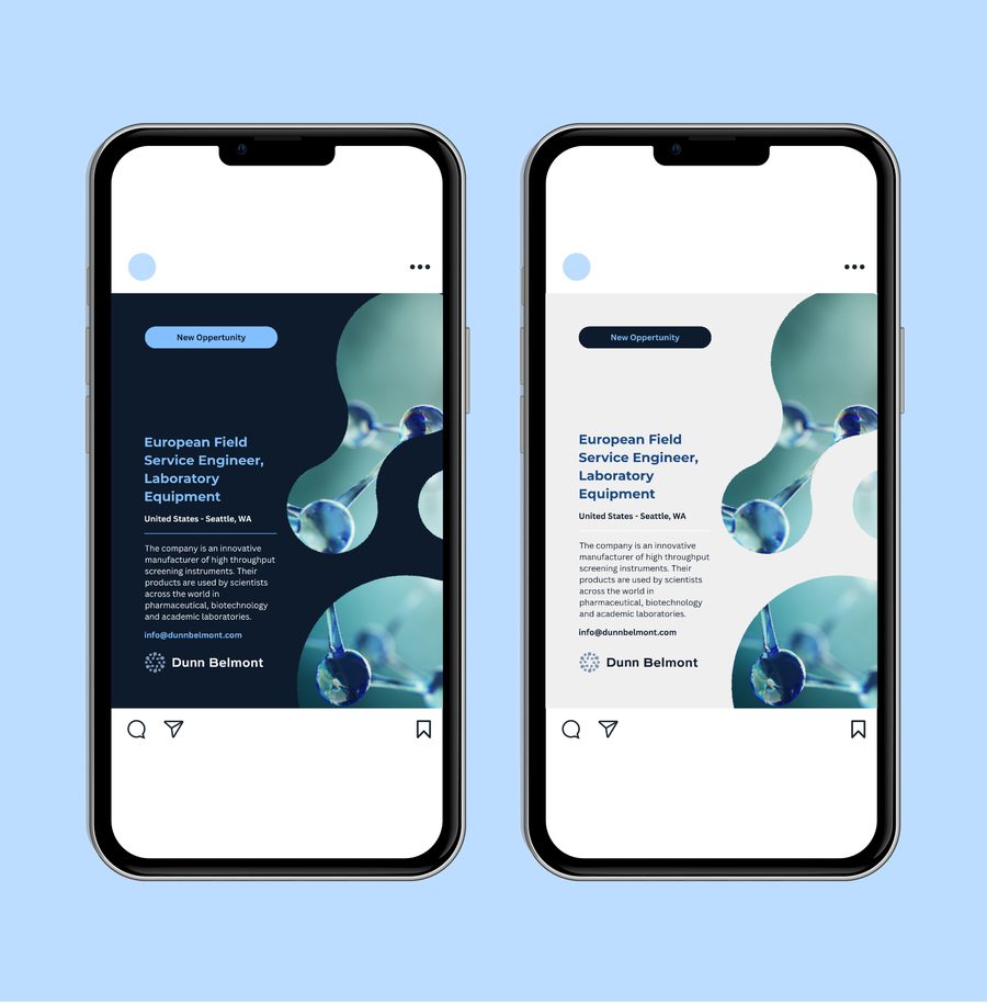

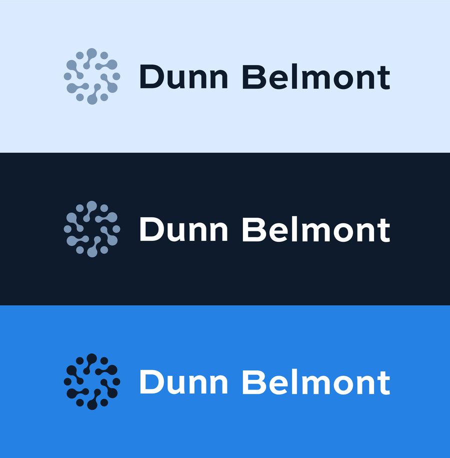
We covered a series of shapes, inspirations from organic and scientific matter and materials that linked together the business with its client base, acting as part of a logo and as standalone elements for use across the new website.
The logo development explored several directions, from modern to more traditional, heritage-led approaches, alongside abstract scientific shapes. The client chose the scientific direction, favouring a clean, contemporary identity that marked a clear departure from the brand’s previous heritage elements.
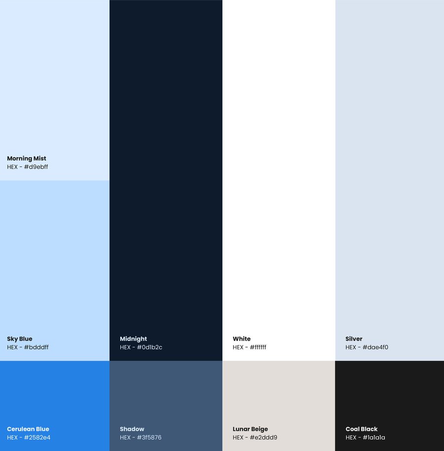
Initially, stronger, bolder blues were explored, but through collaboration with the client, these were softened into a more subtle palette. This allowed the abstract digital imagery and the technical aesthetic found across the scientific industries to take centre stage.
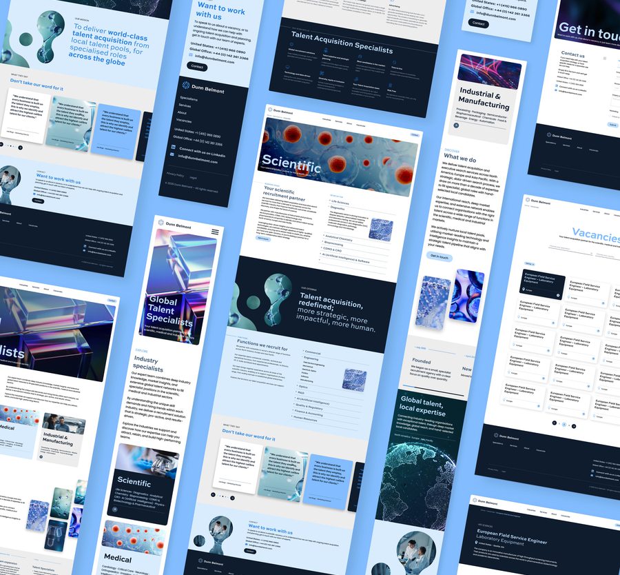
Strong graphical elements drawn from the new logo help tie everything together, creating a consistent identity across touchpoints.
Deliver
A refined, commanding brand that nods to expertise, specialisms and global reach
The deliverables for this project included the final visual identity and brand strategy with comprehensive exploration and decisions on values, pillars, tone of voice and personality.
The result is a brand that feels bold, smart, stylish and relevant to the industries it serves.
This refresh went alongside a website project, handled by our development team.
“Very happy with what we’ve got from the brand and site. It’s above and beyond what we expected, so thank you!”