The most successful brands are those that understand themselves, what they want to communicate and to whom.
Your brand should consist of a series of well explored and considered elements from vision, mission and values to your purpose, personality and more. These inform the brand which ‘faces’ your consumer - your tone, your style and of course your visual identity. It is all of this which speaks to your customer, and builds their all-important first impressions of you.
In this blog, we’re looking at what it means to create a visual identity, how it’s done and why the colours, fonts and elements need to be chosen to send carefully chosen signals about your brand to the recipient.
What your visual identity means and why it’s important
When we think of our favourite brands we instantly think about the identity design. Why is this so? Because they are impactful and memorable, we associate our feelings and emotions - not just with the product - but with the brand itself. What do you think about when you see the famous McDonald’s arches or the Starbucks icon? An identity is emotive.
We all know that a brand is much more than a logo. However, your identity design is one of the most crucial parts of your brand. It’s the first thing we notice and take stock of. When done right, an identity communicates effectively what and who a brand is.
What are the elements of a visual identity?
What’s involved in a visual identity? An icon, a certain colour or a nice font type? It’s a combination of all three. Everything in your visual identity needs meaning and substance; it needs to reflect your strategy, attributes and values as a brand.
If you haven’t already undertaken this work, then this must come first. Your visual brand is a representation of everything else you are, so it needs to follow the strategy and exploration sessions.
A brand identity consists of:
The logo mark
The typography
Colour palette
So how is this all done with the above? Let’s go into detail…….
Visual brand identity example: BishopSound
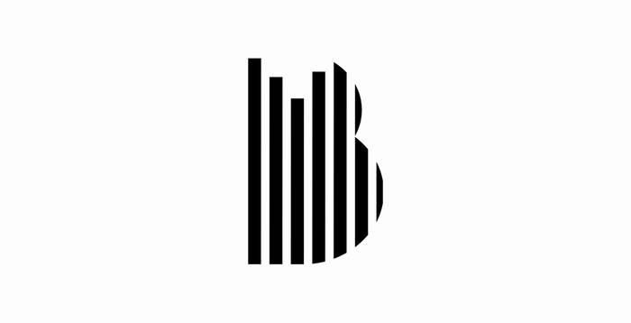
One of our favourite past brand projects at Extreme was the rebrand of BishopSound; they design and supply speakers worldwide from their Ripon-based headquarters in the heart of North Yorkshire. They deliver a unique and refreshingly clear ‘British sound’, including for public performances.
A lot of big brands out there use an icon or a mark as a focus of their identity. Take for example Nike or Spotify; it's a great way to communicate, through symbolism, what a brand is. A big part of the BishopSound ‘brand’ is the owner Andrew Bishop himself, he’s the face and voice of the company, offering a personal approach to each customer.
The icon design in this case focuses on the letter ‘B’ for Bishop, styled up to look like an equaliser, a nod to the sound industry. Simplicity is important when it comes to an icon or logo mark. The most impactful and effective designs demonstrate just that.
A sans serif font gives a look of professionalism, simplicity and with a modern feel. A clean typeface to reflect the clear sound of the product. A certain typeface should be used not only to balance and work in harmony with the rest of the design but to reflect the value of the brand. In this case, a serif font just wouldn’t fit due to the tone it resonates - grandeur and authority.
The ethos of ‘Great British Sound’ was communicated through the use of colour, in this case that of the Union Jack, red white and blue. Each colour has its own strengths. Red demonstrates confidence, blue, trust and white simplicity. All values associated with the BishopSound brand.
The stages of brand visual identity development
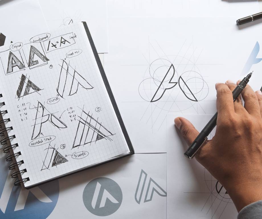
Before we even pick up a pencil or fire up Adobe Illustrator, we’d need to look at what your brand as a whole is. Your brand’s values and tone of voice help your designers shape ideas. When we’ve put in the hours of research, looking at the industry of your company or product, then we can begin the design process.
Mood boards
Mood boards are a great tool to show different directions for your design. Using colours, imagery, typography, styles and textures helps to clearly show a route to take the identity in. It also allows your team and your designers to think about the rest of your brand, including how different supporting elements can work in harmony with the visual identity.
Concept creation
The fun job can now begin, fleshing out different ideas. Initially these are produced in a monotone colour scheme; this is to see whether the design still has an impact when the colour is inverted. When we undertake this process, the rest of the creative team are usually involved. This is crucial, to hear other viewpoints. It allows your design to think differently and consider other angles - do they still get the same look and feel of the design? If not, why?
Finalising designs
Once the favoured designs are selected, they are then presented to the wider team (or, in our case as a marketing agency, the client!). The relevant designer will present this with rationale, this helps build understanding and excitement. Mock ups are a great tool to use at this point. It helps show how the final designs will look out in the public domain.
More than meets the eye
These elements work together to tell your audiences a story about your brand. When you see a logo, you respond to it, even without necessarily realising. Colours have psychological impact and meanings, as do fonts - for example, you probably wouldn’t use comic sans if you’re marketing a funeral parlour…this is why this process is so involved and may involve workshops and strategy sessions ahead of making a decision.
Let’s build your brand together
Expect to spend some time and money on developing a brand - there’s much more than meets the eye. Your designers and creative team will lead you on transforming your vision, mission and values into a brand that is always working, even when you’re not.
Need some help getting your brand off the ground? Click the ‘get in touch’ button below. You can also drop us an email at hello@madebyextreme.com, or reach us on the blower at 01423 396959.
Let’s create something incredible.
Get in touchPost by

As our dedicated Social Media Designer, you'll find Sally behind either behind a screen or behind the lense capturing the essense of all the brands we work with. As Extreme's star baker, you might also find her in the kitchen cooking and styling dishes to look mouthwateringly delicious. If you ever find yourself drooling on your phone, that's probably one of Sally's creations!
Project
Post by

Rob brings bags of experience in design to his role as Senior Digital Designer at Extreme. Away from work, he loves illustrating, watching football and exploring the outdoors (admittedly not all at the same time). He can also solve a Rubik's Cube in under three minutes!
Project
Post by

Amy joined in 2014 to set up our Content department. She now heads up a growing Brand and Content team, utilising over 13 years’ experience to deliver brand awareness through targeted, multi-channel copy. As well as engaging content for websites and blogs, Amy delivers PR strategies and tone of voice exploration, helping clients to communicate the purpose and values of their brand with maximum impact.
Project
