Most businesses know by now that their site needs to function well, but as consumer expectations grow, so does the list of requirements for making your site perform to meet these standards.
Simply having a nice looking site will not cut it; you need to ensure that once you have that visitor, that you give them everything they came for — plus more. If you cannot provide the answers they need, or a smooth experience, you’ll lose them and they may end up abandoning that basket, or clicking away to find it elsewhere.
So, what makes a good website design?
8 characteristics and qualities of a great website
Good websites combine technical consideration, well-written copy and strong design so they can stand out/be memorable and perform correctly. You can attract someone to your site with how it looks/sounds, and retain them with how it functions if you do everything on this list.
1. What’s in a (domain) name?
If you were of high-school age or younger when you created your first email address and you’ve ever had to scramble to create a new one for a job application, then you’ll know all too well that names matter, and in a professional setting, we want to set the right tone - the same is true of your domain name.
Domain names are an important first step in getting your new site ready and you want to make sure that the address you choose is clear, features your business name and is as simple as possible to remember. Challenges can arise if your desired name is already taken, but your best move is to focus on the next, most sensible option that works within your name, what you offer and how people may refer to you. Memorable is good, but it should be for the right reasons.
2. Excellent overall user experience
User experience (UX) quality is vital - consumers will simply move on to a competitor if you’re not willing to invest in the UX that your site delivers. Of course, the UX discipline covers a lot a ground, but there are a number of cardinal sins:
Responsive - make your site mobile friendly. It’s expected now that 85% of adults think that a company’s website should be as good, or better on mobile.
Huge nested drop downs and hard-to-navigate pages - sometimes, less is more. If you make your site a maze, people will lose interest and/or patience.
Confusing, long-winded or complex checkout - keep things as simple and efficient as possible - use social autofill wherever possible, save them time and keep their custom. Websites built using popular e-commerce platforms like Shopify are great for keeping things familiar and seamless for users.
Lack of clear, simple calls to action - make it as simple as possible for users to achieve their objective - be that a page visit, enquiry or checkout.
Some of these faux pas will be discussed as points in their own right because they’re just that crucial to the functionality and success of your site! Let’s continue.
3. Get your content right
Content is a vital part of the website user experience because it provides the trust signals, the authority; good copy is crucial for your site’s SEO, too. It’s what you say and how you say it.
Besides this, consumers are increasingly seeking quality content. 38% of people will stop engaging with a website if the content or layout are unattractive, so it matters, but more on design later.
Content is a commonly overlooked part of the website process - largely because it tends to be assigned to someone who ‘thinks they can have a go’, or because the assumption is the old content can just be rehashed and used in the new site.
You have a staggeringly short 0.05 seconds before your site visitor decides they want to stay or go when they land on your home or landing page. You need to be doing everything you can to quickly, efficiently and authoritatively tell them that you are the place they are looking for - provide the information, make your purpose and/or USP clear, make it simple.
Fussy, overcomplicated, confusing or otherwise obtuse language and unnecessary words will reduce your chances of catching their attention effectively.
Beyond your page copy, you need to consider the appropriateness and suitability of your product pages and articles for search engines. Content creation is a crucial part of any website or marketing strategy, but any piece of content is only as strong as the data that informs it.
By creating content that is informed by keyword research, and covers these chosen topics in depth, you can appear in front of users at various points on their journey as they search and discover more about what interests them.
Speaking authoritatively will help build trust and position you in the minds of audiences as the expert - even if they are not yet ready to buy, you become memorable.
4. Design and imagery
Many of us are very visual creatures, we judge quickly on sight and this is all part of that 0.05 seconds we have to capture the site visitor’s attention when they land on your page. If we have limited time, then strong, clear and impactful design is key to keeping your visitor on site. This means looking great, but of course the functionality has to match.
Some must haves include:
Strong, clear visual identity
Arresting brand colour palette that speaks about your intent, vision, style and approach
Quality product imagery - no stock photography
Clear buttons/calls to action
Uncluttered layout
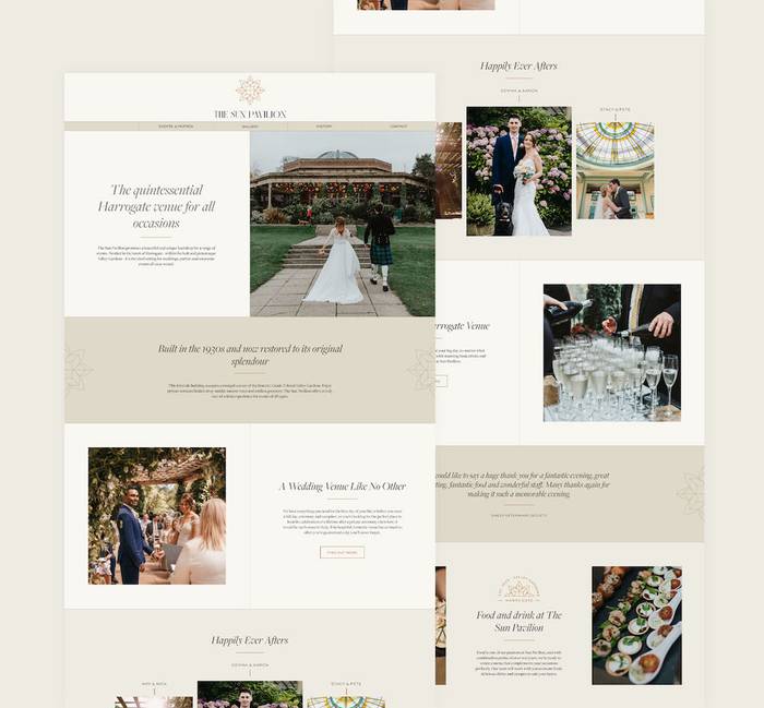
One project we’re particularly proud to have worked on is for Harrogate’s very own The Sun Pavilion. We took their old brand and gave it a stunning refresh before applying this to their new website.
5. Make it fully mobile
This is part of your general UX considerations, but since more than 60 percent of web traffic came through mobile devices, it warrants its own point. Which means if your site isn’t responsive and cannot perform on multiple devices, it will not make the cut with your consumers.
We live and breathe our devices now, and while many of us may use desktop for larger ticket item purchases, it is still mobile we do a large majority of our day-to-day researching on.
Your mobile site should be as simple, usable and easy to engage with on mobile. People don’t want squashed images, reams of text and a five minute scroll to find the page they need. Do not neglect this part of your site’s functionality, as doing so will dramatically limit your performance and ability to grow and retain your consumers/audiences.
Here, Waterstones has a features section with broad appeal, offers a simple way to search, find store locations and also makes recommendations based on bestsellers. This gives any book fan a simple, fast view of what’s on offer and easily facilitates any kind of search or intent-led activity. It’s also clean, uncluttered and encourages a personalised experience through sign in and wishlist features.
6. Calls to action
Don’t do all that incredible work attracting users to your website through social media, PPC or organic search only to leave those precious visitors a bit confuddled.
Calls to action are crucial to securing completions and sales. They are important guides to the process and ensure your consumer can find what they need at various points of the journey. These can come in many forms, such as buttons, forms, pop-ups, links. Important calls to action include:
Contact details - make it easy for users to reach out if they need help or have questions (think live chat/a phone number)
Buy now or pay now buttons
Now, we’re back to content because your calls to action have to be succinct, enticing and action-oriented - no one is clicking a button with a paragraph on it, so you need to consider what they say as well as what they are for and how they look.
Try now
Buy now
Get started
Subscribe
Get in touch
7. Trust signals and reasons to believe
An important part of retaining your visitor is giving them reasons to believe that their custom, time and money is best spent with you and that is achieved via trust signals. Trust signals include things such as testimonials, user generated content, accreditations/awards and reviews.
Where you house and showcase this information is of vital importance. Your homepage, key landing pages and product pages all demonstrate your customer service, product quality and more. Where they need to live will depend on how users work through your site, and it is possible to track this so ensure you can meet them where they are likely to land.
Trust signals can also be the partners and other brands that you’ve worked with; those that have used your products. This can be displayed with their branding and logos or, if your product has been used somewhere noteworthy, you can demonstrate this with a message such as … ‘as seen on’.
What these elements add to your site are credibility, reassurance and a sense of authority. If you have glowing reviews and testimonials in key locations on your site, then your new customers have maximum opportunities to see and engage with this, further supporting the decision making and aiding their conversion or goal completion.
Snag Tights is a company that utilises a huge amount of consumer reviews in its marketing, both on the website and its social media platforms - who better to attest to the product’s quality than their happy customers?
8. Easy navigation and checkout
If your site is built for e-commerce, then it is imperative your checkout process is as smooth and simple as possible. Putting all the work in to support the customer in their journey this far, it’s a crucial point and you don’t want to lose them. In fact, 17% of cart abandonments on mobile are down to long and complicated checkout processes, so don’t risk losing them the final hurdle.
Help your customer with any autofill possibilities, offer expected payment options such as PayPal or Apple Pay where possible. The aim is speed, simplicity and simple options for delivery.
Other factors that can impact the likelihood of cart abandonment include:
Security issues/concerns
Shipping concerns or costs
Site speed
Lack of opportunity to edit orders on page
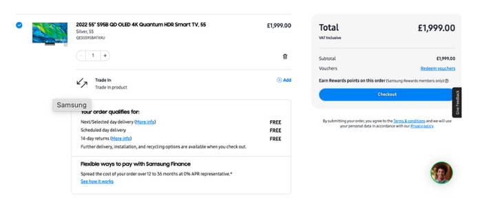
Samsung is just one example of a brand with a great checkout page, obeying all the important rules. It is clear, makes shipping options apparent and you can edit from this page while seeing the updated total on the right at all times.
Using an e-commerce platform like Shopify makes it easy to ensure you’re providing a seamless experience. Most people are familiar with their checkout gateway.
Of course, being user-focused is about all your other activities: behavioural email marketing (with abandoned basket follow ups) is a great way to entice people back to their basket if they’ve fallen off during the checkout process.
We design websites that do the business
So, how many of these things does your site have? Or maybe you’re reading this and thinking ‘oh, we have work to do’.
If that’s something you need help with, then our team of digital experts is on hand to help. Get started on the site your customers want, today.
Ready to create a great website?
Drop us a messagePost by

Amy joined in 2014 to set up our Content department. She now heads up a growing Brand and Content team, utilising over 13 years’ experience to deliver brand awareness through targeted, multi-channel copy. As well as engaging content for websites and blogs, Amy delivers PR strategies and tone of voice exploration, helping clients to communicate the purpose and values of their brand with maximum impact.
Project


